Picture Book Review: Way Past Mad by Hallee Adelman

Illustrator: Sandra de la Prada
Albert Whitman & Co.
1 March 2020
32 pages
This month’s PB review is by OPB superfan Ryan G. Van Cleave and Florida-​based author/​illustrator Linda Shute.

–Ryan’s Review of the Writing–

It’s incredibly challenging to create a picture book that primarily deals with emotions, but that’s the task Hallee Adelman sets for herself in Way Past Mad. Right from the start, our protagonist Keya is indeed wronged–her little brother Nate messes up her room. Then he inexplicably feeds Keya’s breakfast cereal to their dog. While those two things don’t seem especially malicious, the fact that he “ruined my favorite hat” puts Keya over the edge.

I get it. Little siblings can drive you bonkers. I know that truth from my own childhood, and I see it in the sometimes-​tumultuous lives of my two daughters.

Adelman presents Keya’s anger in this story as something that makes one lose control. That sense of being out of control is shown in how she kicks rocks and sticks on the way to school, and in how, for her, it’s “the kind of mad that starts and swells and spreads like a rash.” That’s a memorable way to describe being mad, though it feels a bit off in that anger flares to life and grows far faster than any rash does, both in real life and in this story. In contrast, Keya’s happiness at the end of the story that “starts and swells and spreads like a smile” feels like a much more apt comparison.

For me, the fuzzy part of Way Past Mad was coming to grips with what being mad is to Keya. If she’s “way past mad,” how can Keya blame it for her saying unkind things to her friend, Hooper (“But my mad made me say it”)? This might seem like I’m nitpicking, but is being mad a destination/​place/​situation/​state of being, or is it its own thing, like an entity one must deal with, as some books present via personification? Does anger have power over you? If so, how can that be the case if one is “way past mad” versus, say, being in the “clutches of anger” or something along those lines?

While Keya owns up to her anger-​infused behavior and apologizes to Hooper, there’s no parallel resolution with Keya’s little brother, despite him doing the three things that kick off this emotional story. Keya clearly values friendship, however, and she learns that things done in the heat of anger–though that’s my language again that doesn’t quite jibe with how this book presents it–aren’t usually that helpful, and those are solid takeaways. I just wish the level of emotional insight the book offered from start to finish was as rich and compelling as the terrific, bold cover that initially drew me to this book.

3.5 out of 5 pencils


–Linda’s Review of the Illustrations–

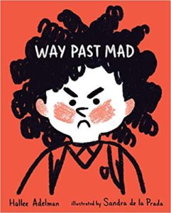
The jacket for Way Past Mad attracted me–a little girl’s furious face boldly drawn in white and black on a bright red background. But we are not introduced to this narrator on the opening page. Bright plaid endpapers and cheery repetitive colors dissipate the cover’s promise of drama. This is a story of building anger that explodes into regrettable action, leaving the protagonist in a dark, lonely place until she finds resolution. What I miss here is a visual story arc that supports the text’s arc.

Design strategies–varying the focus, or the size of the art (like in Where the Wild Things Are), expressive color temperature and dark/​light values, mood-​setting endpapers and front matter–can reinforce story and feelings. Instead, the frown on Keya’s face is our primary visual indicator of her emotional landscape.

During the story, Keya fantasizes she is a champion runner, but there are no compositional clues to indicate these three scenes are in her imagination. She shows up later, in “real time,” wearing the star she won during her fantasy, which furthers the confusion.

Sandra de la Prada created appealing characters and did a competent job illustrating Way Past Mad, but I cannot help regretting opportunities missed by her and the book’s art director/​designer.

3 out of 5 crayons


Linda Shute is an author/​illustrator who earned a degree in art and art history at Florida State University and taught children’s book illustration at Ringling College of Art and Design.
She loves peanuts and beach sunsets.

Picture Book Review: A Crazy-​Much Love by Joy Jordan-Lake

Author: Joy Jordan-​Lake
Illustrator: Sonia Sánchez
Two Lions
17 Sept 2019
32 pages

This month’s PB review is by Ryan G. Van Cleave (Fan of All Things Crazy–especially Love–at Only Picture Books) and Ringling College of Art and Design Illustration Professor (and OPB superfriend) John Herzog.

–Ryan’s Review of the Writing–

I’ve got a soft spot in my picture-​book-​loving heart for stories that help children better understand what it is to be loved (like Sam McBratney’s Guess How Much I Love You, Robert Munsch’s Love You Forever, and Matt de la Peña’s Love, to name just a few of my favs), and A Crazy-​Much Love is in that same sweet spirit.

From the very first line–“You are the one, precious child–did you know?”–it’s clear that this story is from the point of view of eager, excited, and thankful parents who are telling their daughter exactly how she came to be part of their family. Not just any part, either, but a vital, important, and unique part, as seen in lines such as: “You were the one we hoped for, and prayed for, and piled up stuffed bears for.”

From first words to first steps to a first ride on a trike, the parents recount milestones with joy, compassion, and love. At times, though, the child asks questions that any child–adopted or not–might eventually wonder. “How much is the crazy-​much love?” and “How long does it last, the crazy-​much love?”

It’s a nice touch to have the child laugh when asking those tough questions because, as the story says and the parents know, “you already know.” Of course she does. There’s a sense of ritual to this family’s origin story that feels like the sort of thing they regularly tell, just as some kids love to flip through photo albums or request a favorite story over and over.

The answer to the child’s questions powerfully comes across via the smiling faces of the entire family in the art as well as in the powerful refrain “It was you” which, at the very end of the story, becomes “It is YOU.” It’s no surprise to learn that author Jordan-​Lake is drawing upon her own experience of adopting a child from China here because the emotions here feel honest and true.

This is a terrific addition to anyone’s bookshelves, whether they’re part of an adoptive family or not.

4.5 out of 5 pencils

–John’s Review of the Illustrations–

2019 has been a year marred by incessant bedlam. Every day, news organizations dish out an onslaught of stories that detail corrupt leadership, international conflict, wealth inequality, civil and equal rights violations, and so on and so on. Given all of this madness, how grateful I am to close out this year with a review of A Crazy-​Much Love, in which the only major conflict is a child sneaking their dog onto a school bus.

The story by Joy Jordan-​Lake is a simple yet effective one: Told from the perspective of an eager young couple, they adopt a child from another country and narrate the book, telling said child about their “crazy-​much love” for them. The book is a straightforward love letter from parent to child that most everyone can relate to, and (thankfully) strives to be nothing more.

Contrasting that simplicity are the wonderful illustrations by Sonia Sánchez. While they are on the messy side, they’re chock-​full of all-​too tangible expression and life. The compositions and colors start off fairly simple, then become more visually rich and complex after the child is brought home. I really enjoy how the “crazy-​much love” is first depicted as simple shapes and colors, then evolves into more complex shapes and colors as the child grows older. The character designs are also incredibly fun and relatable, with subtle nods to the likes of Quentin Blake and Mary Blair.

I must admit that A Crazy-​Much Love really struck a chord with me on a personal level, as I have some incredibly close friends who have adopted several children. It’s fantastic to see a book like this where their story, along with countless others, is represented. If anything, I’m thankful to end the year reviewing a book like this, which extols the virtues of love, patience, and compassion. We’re definitely going to need them as we head into a potentially turbulent 2020.

4.75 out of 5 crayons


John Herzog is an illustrator and educator. His clients include Hasbro, Dreamworks TV, Houghton Mifflin Harcourt, and Highlights for Children. He also teaches illustration classes at Ringling College of Art and Design. John is a member of the Society of Illustrators and SCBWI, and received the 2018 SCBWI Magazine Merit Award for his Highlights High Five cover illustration. He lives in Florida with his wife, two kids, a tarantula, a bearded dragon, and a fish.

He is represented by Shannon Associates.

Picture Book Review: Pippa’s Night Parade by Lisa Robinson and Lucy Fleming

Pippa’s Night Parade
Author: Lisa Robinson
Illustrator: Lucy Fleming
Two Lions
8 October 2019
32 pages

This month’s PB review is by Ryan G. Van Cleave (#1 parade aficionado at Only Picture Books) and Ringling College of Art and Design Illustration Professor (and OPB buddy) David C. Gardner.

–Ryan’s Review of the Writing–

Pippa has a problem–a “wonderfully wild imagination” that sometimes “runs a little TOO wild.” She does just fine at day when her various costumes serve as armor, but come nighttime? She worries about “villains and monsters and beasts.” Indeed, they pour forth from the darkest corners of both her imagination and her bedroom to cause grief.

Pippa finally tries to tackle her fears head-​on through an invitation to all monsters to come out that night for the Scary Night Parade. Her hope is to deal with the lot of them, once and for all. Yet it doesn’t work out as she hoped. But Pippa refuses to quit. Her next attempt to deal with the monsters leverages something she’s loved from the start–fashion. She’s a big fan of dress-​up. When she brings out the “sashes and sequins and bows” and “belts and berets and shawls,” the critters get into the fashionista spirit and participate in the spectacular show.

Robinson wisely doesn’t let the parents save the day (they quite reasonably send Pippa back to her own bed “again and again and again”). She also presents Pippa as being able to overcome her greatest weakness/​fear through the use of an existing strength. That’s an empowering thing for kids to consider.

Pippa becoming the leader of the monster pack feels like a quiet nod toward Where the Wild Things Are, too, though it’s a bit unfair to compare any book to Sendak’s nuanced masterpiece.

Many readers will delight in Robinson’s attention to the repetition of sound, such as “designs a disguise” and “beasts and brutes and baddies.” They’ll likely enjoy the presentation of Pippa, as well, since she’s a plucky dark-​haired girl who uses her imagination plus problem-​solving skills to get past a common childhood issue.

The well-​wrought cartoony illustrations help bring it all together and keep this story more fun than frightening.

4 out of 5 pencils

David’s Review of the Illustrations–

A light in the darkness.

It starts with the cover: Pippa, victorious, wields a flashlight. Banishing fears with light is the major motif that illustrator Lucy Fleming finds to bring this minimal text to life. It’s a lovely, visual way to capture Pippa’s solution to her bedtime fears.

Along the way, Fleming has plenty of room to add playful touches, like adding a cute white cat (notice: not a scary black Halloween cat!) who accompanies Pippa, like a witch’s “familiar.” The palette is perfect for Halloween, lots of violet, starting with the end papers, complemented with yellow throughout.

This book is clearly aimed at a very young crowd. The pictures are mysterious without being too scary, with plenty of humor, action, and movement. Her monsters early on take the form of ghostly shadows, in one especially clever extension of the text, unscrewing the lightbulbs over Pippa’s bed when she “tries extra nightlights.”

Pippa’s whimsical answer to defeating the monsters? Dress them in silly costumes. That whimsy is echoed in Fleming’s loose, sometimes flattened style, colorful and bright, even at their spookiest, bringing to mind the way a child might draw and color the action.

It would be a mistake, though, to dismiss Fleming’s pictures as naïve. She draws Pippa as a big-​headed kid in the style of the great Mary Blair, a Disney stylist from the 40s through the 60s (think “It’s a Small World”). Blair’s approach is much imitated in picture books today. Fleming even mimics Blair’s gouache painting style, except her opaque watercolor and colored pencil is all created digitally. She manages to bring to it a texture and warmth that feels made-by-hand.

The neatest trick of all: The text moves in and out of Pippa’s mind as her real world intersects with her imagination. To a very young child, there’s not much difference between the two worlds. Fleming blends them, painting a vivid picture of Pippa’s inner and outer landscape, drawing us into the story more deeply than the text alone could manage.

This is a simple story, but a difficult, archetypal one in a child’s development. Fleming manages to help it all go down like Halloween candy.

4 out of 5 crayons


David C. Gardner is an award-​winning illustrator and visual development artist. A former artist for Walt Disney Animation Studios, he has illustrated numerous picture books, including his latest from Sleeping Bear Press, Write On, Irving Berlin! by Leslie Kimmelman (which appeared on OPB not so long ago). It tells the true story of little Izzy Baline, who immigrated to New York City in 1893 and grew up to become Irving Berlin, one of the most well-​known composers of popular music in America. David teaches illustration at Ringling College of Art and Design.
To learn more about David’s own work, please visit FlyingDogStudio.com.

Picture Book Review: Bird Count by Susan Edwards Richmond

1 October 2019
32 pages
This month’s PB review is by Ryan G. Van Cleave (#1 Birder at Only Picture Books) and and Florida-​based author/​illustrator Linda Shute.

–Ryan’s Review of the Writing–

I’m always intrigued when a nonfiction book idea finds a quality story to match, which is what happens here. Instead of giving us “Bird counting happens throughout the world each year at Christmas thanks to the efforts of the National Audubon Society” etc., we get the story of Ava, a kid who loves birds and is excited to participate again this year with her family. Because she’s a kid, we’ve got people around her like Big Al to (believably) help remind her about the rules and best practices. Who knew that a citizen scientist’s most important tools are eyes and ears?

Ava knew, and now the reader does too.

We can tell how special this particular bird count is to Ava because she alerts us to that fact. “I look at Mom and smile. This is my first time,” she says about her being asked to record the names of all the birds they count. What’s especially fun is that the book layout has a spiral-​notebook part to the page where bird names appear as Ava writes them down.

One of the many lessons here is that rules matter. The rules say a bird can’t be counted unless two people see or hear it. So, when Ava sees a mockingbird that “flaps away in a flash of gray and white,” she can’t add it, despite really wanting to. “But Mom and Al missed it. So it doesn’t count.” Don’t worry–she finally sees one later and can add it to the list then.

Richmond’s use of language is compelling, too–especially when trying to capture the noises birds make, such as “Pssshh, pssshh, pssshh” and “mourning doves coo-​hooing.” (The name of that bird is bold as are the names of all 24 types of birds that get counted.)

Part of what give this story a bit of tension is Ava’s hope to see a raven, as she’d done a few years back. Will she see one again this time? She sure hopes so.

Generous but appropriate back matter completes this fine introduction to the world of birding.

4.5 out of 5 pencils


–Linda’s Review of the Illustrations–

On the outside, Bird Count looks like a book for the preschool crowd–large squarish format, simplified head of a young girl on the front. Inside, there is text and information galore. I hope its exterior doesn’t signal second and third graders to pass it by.

The content is presented in wonderfully clear, consistent layouts. Except for the opening and closing, a wire-​bound notebook with the growing list of birds appears on the right edge of the double-​paged scenes of the day. The narrative text is generously line-​spaced, often on ample snowy areas of the compositions. Cheers to Peachtree designer Nicola Simmonds Carmack for the elegant and easily read fonts throughout, the heavy matte coated stock, and attention to details that make this a well dressed and durable book.

Stephanie Fizer Coleman was a natural choice for illustrator. See her “paint a bird a day” for 100 days project at http://stephaniefizercoleman.com/100-birds‑1 Coleman’s page designs are simple with strong elements leading left to right. Figures and faces are stylized, lending a detachment that keeps the focus on the birds and their environs. A palette of soft blue, lavender, and browns provides a subtle background to neutral colored birds. The art is rendered digitally with textures that appear to be brushy, sanded gouache and whites that recall frosty surfaces. The calming hues create a restful bedtime offering. And, for the “look again” reader, there is a rogue great horned owl!

5 out of 5 crayons


Linda Shute is an illustrator, writer, and teacher living near Sarasota, FL. There is never snow in her yard, and most of the birds have very long legs and croak!
See a few at www.lindashute.com.

Picture Book Review: Along the Tapajos by Fernando Vilela

See the source image

Author: Fernando Vilela
Illustrator: Fernando Vilela
Translated by Daniel Hahn
1 October 2019
40 pages
This month’s PB review is by Ryan G. Van Cleave (Top Riverboating Fan at Only Picture Books) and and Florida-​based author/​illustrator Linda Shute.

–Ryan’s Review of the Writing–

Author/​illustrator Fernando Vilela’s Along the Tapajós tells the story of Cauã and Inaê, a brother and sister who live in a small village along Brazil’s Tapajós River. (Here’s a map and more information about the river, in case you want a fuller geographical context for this story.) While all of their homes are up on stilts, the rainy season brings so much water that the entire community relocates to higher, drier ground. When they get to their new temporary home, the kids realize the problem straight away–they forgot their pet tortoise, Titi. A tortoise isn’t a turtle, so he can’t swim to safety on his own (turtles can swim whereas tortoises can’t). The pair hatch a daring plan to sneak back at night on a journey along the river to rescue him. Will they be able to save Titi in time before the waters get too high?

Foreign words won’t prove daunting here. Other than the names, there’s only one in the entire story, and it’s well-​glossed within the text. (Pa always finds a good spot, someplace sunny and close to an igarapé–that’s a kind of waterway.)

Readers will surely enjoy comparing the world of these kids to their own–the stilt houses, the school only reached by boat, the big critters (alligators and anacondas) lurking in the water, the idea of a two-​season year, a community-​wide annual migration, etc. All of that might lead to interesting discussions for sure.

The ending of this story, however, is potentially troublesome. Once the kids realize that Titi has been left behind, they disobey their parents who specifically tell them NOT to go back for the pet. And while on this unapproved rescue mission, they encounter an anaconda who’s about to gobble up the tortoise and both kids. But doesn’t. Why? It’s an unexplained deus ex machina moment. (“I don’t know how it happens, but when I jump back into the boat with Titi in my arms, the queen of the jungle gets all tangled up!”) Lucky for the kids and Titi, sure, but that’s the thing–they win via luck, not through their own efforts. Taken together, those two story moments might not sit well with readers.

Still, the book offers a lot of vivid details about this community that are interesting and extremely well-​depicted, visually speaking. And the backmatter, too, is quite fascinating and full of compelling facts, details, and images. The real selling point of this book, though, is the pictures. See what Linda has to rave about below!

3.75 out of 5 pencils


–Linda’s Review of the Illustrations–

The art in Fernando Vilela’s Along the Tapajós snags the eye and enlarges the interpretive experience of American children. It is a textured panorama reflecting the energy of its creation and the urgency of the story it tells. The marks are slashed, carved, and incised, the palette basic–mostly flat tones of greens, browns, red and yellow on an armature of black. The effect is of layered, hand-​printed folk art. The river is a gouged wood block printed edge to edge across the pages, over and under other elements. Palm fronds, lily pads, oxen, fish, birds, the snake’s pattern, and the catwalk supports are stamped on freely. The pages are filled with details authentic to the cultural setting and invite reexamination and discovery.

The figures, however, are drawn, and the sister and mother wear flowered collaged dresses. Their black outlines are angular and sometimes crude. The faces are appropriately simple but expressive cartoons. The only stylistic distraction for me was a capybara pair that seemed Photoshopped additives.

Although the viewpoint voice is the boy’s, the book’s visual main character is the tan river which dominates virtually every page. The double spread riverside landscape might backdrop two or three sequential actions of the boat and children, an ingenious design maneuver to avoid fracturing the flowing scene. The river carries the action forward, the villagers to their winter refuge, and finally transforms the world we first entered. When the children return to rescue their tortoise from their now-​submerged home, they find the land structure and water creatures dreamily melded. The closing endpaper, a rainy season redux of the opening dry season endpaper, brings us to a satisfying and thought-​provoking full circle.

5 out of 5 crayons


In 1996, Linda Shute traveled in a small boat up an Amazon tributary similar to the Tapajós River and visited a school like the one in this book. The Escola Bosque had a poster of Elizabeth Taylor on the classroom wall!

Linda is an author/​illustrator in Nokomis, Florida. She has taught at Ringling College of Art and Design, is a member of The Children’s Book Guild of Washington, D.C., and was Illustrator Coördinator of Florida SCBWI the past nine years.

Visit her at https://lindashute.com

Picture Book Review: Spiky by Ilaria Guarducci

Spiky by [Guarducci, Ilaria]
Author: Ilaria Guarducci (translated by Laura Watkinson)
Illustrator: Ilaria Guarducci
Amazon Crossing Kids
1 July 2019
36 pages

This month’s PB review is by Ryan G. Van Cleave (Top Spiked Friend at Only Picture Books) and Ringling College of Art and Design Illustration Professor (and OPB wunderkind) John Herzog.

–Ryan’s Review of the Writing–

Originally published in Italy, Spiky is now in offered in an English-​language edition thanks to the efforts of award-​winning translator Laura Watkinson. (I know Laura’s work. Her Dutch-​to-​English work on Tonke Dragt’s YA novel The Letter for the King is great–it’s going to be a Netflix series too, I hear!).

I have mixed feelings about this book. Let’s start with Spiky himself. There’s no two ways about it–he’s a jerk. He lives in the dark forest where he spends his days being a bully. He’s also a little too enamored with his own spikes, which he loves since they help keep everyone at a distance.

He was spiky, he was bad, and he didn’t need anyone at all.”

Thanks to being sent to bad school by his father, Mr. Spikington, Spiky grew even more nasty. He stole snacks. He raised a ruckus. He tormented the trees. And he “pulled the wings off butterflies. If he couldn’t fly, why should they?”

I’m all for showing how a PB creature isn’t doing good things, but Spiky doesn’t stop there. He captures robins and sticks them in jars. He plucks the petals off flowers. He pricks holes in snail shells. He laughs at toads for “being so ugly.” I worry that some readers will stop at this point because it’s all pretty one-​note, and it’s very, very dark, too.

The second potential hiccup I see is that one day, for no given reason, he starts to lose his spikes. I fully understand how this makes sense plotwise–it’s a way to turn the tables and disempower the nasty critter called Spiky by stripping the physical element of menace from him. But in terms of story logic, this seems random. That troubles me all the more so because it could’ve easily been connected to an action Spiky took in all of his wrongdoings–poetic justice of sorts.

When Spiky’s finally gone bald as a naked mole rat, he’s lost his power. Yet the bully now gets teased in return. The snails sneer. The toads titter. I’m not sure that’s the right lesson here for young readers, though admittedly, we all take some bit of joy in seeing a tormentor get their due.

From this point on, I like a lot about the book. Bernardo the bunny is a hip (hopping!) character with Yoda-​wise advice and a kumbaya mentality. Spiky, too, gets a personality makeover.

Then WHAM, Spiky suddenly–without a catalyst or reason again–grows back his spikes. And he’s tempted to return to his nasty ways. Yet he doesn’t because being good and letting friends get close to you, both physically and emotionally, is “very, very good.”

Sidenote: He never apologies or made friends with the critters he tormented. That part feels unresolved.

So for OPB, Spiky is a mixed bag. I admire how Guarducci takes on the narrative challenge of trying to make a villain into a hero. I also appreciate the novelty of such an odd protagonist.

Yet the images are odd at times (see John’s comments below), and the story feels long–mostly in terms of the extended “hey, he’s nasty!” opening with so many examples and the slow wind-​down at the end when Spiky eventually makes the final decision to eschew his old ways.

I wish I could read Italian so I could examine a copy of the original, called Spino, and see if the same things I’m encountering here are evident there. After all, it was shortlisted for the Soligatto Award for Best Italian Picture Book.

100+ Amazon reviews have Spiky averaging 4 stars. OPB can’t quite get behind it with the same level of enthusiasm.

3 out of 5 pencils

–John’s Review of the Illustrations–

From both a storytelling and illustration standpoint, I have some major issues with Ilaria Guarducci’s Spiky, which essentially tells the story of an antagonist who becomes a protagonist. It’s a valiant effort, and I recognize that. However, in both story and images, it’s a bit misguided and muddled.

First, the story: We’re introduced to the titular Spiky, a monster who was raised up to be bad. Not bad as in “putting the wrong items in the recycling bin” bad. No, I’m talking about “pulling wings off butterflies, trapping birds in glass jars” kind of bad. He’s proud of his spikes and uses them to terrorize the forest animals around him. He’s a completely unlovable main character, which is the point (no pun intended). However, as the story progresses, an event happens that completely changes Spiky’s attitude toward life, and this is where things go a bit sideways. First of all, this event is completely out of Spiky’s control, making his change of character involuntary and detracting from the overall message of the story. He’s forced to change, as opposed to changing because he wants to. Granted, this can work in certain circumstancestake the movie Groundhog Day, for example–but it needs to be done in a way where we’re ultimately charmed by the character we originally found repulsive. Spiky never really redeems himself in a believable way, and isn’t particularly charming by the end. I wanted to care, but I just didn’t.

I’m also not sure what I’m supposed to get out of this story. It feels like Guarducci is trying to tackle too many problems all at once. She tries to combine Spiky’s personal change with the importance of positive friends with the whole “don’t judge a book by its cover” message–and it ends up a mess in the process.

Now, the illustrations: There’s such a missed opportunity here to implement some contrast. Everything feels the same, incorporating a faux, digital gouache look and texture. There’s a fine line between interesting and boring, and this fell a bit on the boring side for me. I would love to have seen Spiky rendered with more of a streaky, old marker look so he stands out a bit more–see the example concept art from Monsters University below, which demonstrates this technique rather effectively:

© DISNEY/​PIXAR

As the story progresses and Spiky goes through his change, perhaps then he could’ve looked more like the characters and environment around him to give more of a feeling of unity. But as it is right now, he blends in with the backgrounds and overall texture the entire time, making his journey feel far less important than it really should. The character designs are adequate enough, with Spiky probably being the strongest. However, the bunnies really should’ve been rounder, fluffier, and just cuter overall.

The aspect of Spiky that I enjoyed most was all of the horrible things Spiky would do to the woodland creatures around him. The character’s actions don’t talk down to kids, which I absolutely love. Kids can handle hard things, and this book doesn’t pull any punches. Guarducci does a fantastic job setting up a loathsome character that I want to see redeemed at the end. Unfortunately, due to the muddled story and monotonous illustrations, his redemption ultimately feels dishonest and superficial.

2.5 out of 5 crayons


John Herzog is an illustrator and educator. His clients include Hasbro, Dreamworks TV, Houghton Mifflin Harcourt, and Highlights for Children. He also teaches illustration classes at Ringling College of Art and Design. John is a member of the Society of Illustrators and SCBWI, and received the 2018 SCBWI Magazine Merit Award for his Highlights High Five cover illustration. He lives in Florida with his wife, two kids, a tarantula, a bearded dragon, and a fish.

He is represented by Shannon Associates.