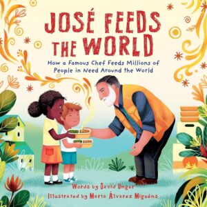
José Feeds the World
Author: David Unger
Illustrator: Marta Álvarez Miguéns
duopress
30 January 2024
40 pages
This month’s PB review is by Ryan G. Van Cleave (Owner/Operator of Only Picture Books) and Ringling College of Art and Design Illustration Professor (and OPB pal) David C. Gardner.
–Ryan’s Review of the Writing–
I’m always interested in the behind-the-scenes story of a real-world hero’s life, and that’s what this book promises to deliver, being pitched this way: “The true story of José Andrés, an award-winning chef, food activist, and founder of World Central Kitchen, a disaster-relief organization that uses the power of food to nourish communities after catastrophe strikes.”
To tackle that big task, author David Unger tells the entire trajectory of José’s life, beginning with him as a child who learns to help others after witnessing his parents do that very thing in their jobs as nurses in Spain. They also loved to cook, and the kitchen soon became José’s favorite room in the house. This is where readers begin to get both the flavors of food (“the smell of rice, saffron, chicken, and sausage floating in the air”) and the sound of the Spanish language (cocina, paella, etc.) directly in the text.
José attends a Barcelona cooking school at 15 and becomes a chef’s assistant and a world-famous restaurant. A few years later, off to the US he went where he cooked in New York City before opening his own restaurant in Washington D.C. Thanks to his love for food and his skill in cooking, José began earning award after honor after critical acclaim.
That’s the end of a version of this story that simply tells how a young Spanish boy became a food rock star. But that’s not José’s story. Instead, he became deeply affected by the 2010 earthquake that devastated much of Haiti. Just as he did as a child, José wanted to help others. So, he gathered a group of friends and went there to cook for the survivors.
After returning to D.C., José knew he could do more for others who needed help. He founded World Central Kitchen, a nonprofit dedicated to providing free meals to survivors of natural and human-made disasters in communities all over the world. The story follows his work to support people affected by disasters in Puerto Rico, the Bahamas, and Guatemala, as well as COVID-related challenges in California, New York City, and the Navajo Nation. There’s even a very brief mention of the Ukranian Food Fighters at the end.
Without a doubt, José is doing amazing work that’s worth knowing about and supporting. The key to making a successful nonfiction picture book biography–or any picture book, for that matter–is to find a way to make the story kidcentric. Why? Because if a kid reader doesn’t love the story enough to ask for re-readings, it’s a one-and-done book regardless of the book’s other merits (such as beautiful art, which is the case here).
I worry that Unger sacrificed too much of the potential emotional depth of the story to portray a more exhaustive recounting of José’s entire life and career, and to put the focus so much on the many efforts of the World Central Kitchen. Another way that might make this book more kidcentric would be to embrace the parts of this story that kids would most likely be drawn to, such as the wonder, magic, and even the sound of food. We have a bit of that at the start, but it gives way to the robust biographical journey that follows.
Directly addressing the reader in the last page (“And one day you, too, will find your calling and make the world a better place”) seems to address the above concern. Does it work? Like the Ukranian mention, it feels more of an afterthought, though I’m pleased the Career Day visuals suggest all kinds of interesting future careers. If it only depicted a chef? That wouldn’t be a hit with most kids, I imagine.
The mission of this story is a very good one, and José Andrés comes across as an admirable humanitarian. There’s a strong sense of a connected world community and a positive sense of diversity here in both the text and the accompanying visuals. I hope this book brings a lot of attention to the World Central Kitchen since that appears to be the main course of this literary meal.
4 out of 5 pencils
–David’s Review of the Illustrations–
Spanish illustrator Marta Alvarez Miguéns starts on a sweet note, showing the roots of José’s compassion: as a boy, in the hospital where his parents worked, bringing water to an elderly patient. His love for cooking starts with his mom in the kitchen. He makes paella with his dad.
In a lovely, abstract flight of fantasy, young José floats dreamily over a giant kitchen table, spices, chicken, and utensils arrayed like a fanciful village, reminiscent of Maurice Sendak’s In the Night Kitchen. Miguéns takes flight again later in the book, depicting a grown-up José filling a steaming pot with vegetables that swirl magically around his head, a magician in the kitchen.
The pictures unfold in travelogue fashion now. José, a teenager, approaches cooking school in Barcelona. He cooks in restaurant jobs in New York and Washington, D.C. In a masterstroke, Miguéns brings the two threads of his life together in a touching double spread: a line in a soup kitchen, each person’s face depicted with care and a poignant dignity as they wait, bundled against the cold.
2010, and José responds to reports of the earthquake in Haiti and flies down to help. An image of local volunteers building rows of sandwiches is especially effective, hundreds of sandwiches laid out in a vast grid. Miguéns is mindful of showing other characters helping José in nearly every picture, suggesting humility in the chef. He is not doing this alone.
Next, it’s off to the Bahamas to help, then Guatemala. COVID appears, along with surgical masks, and Miguéns whisks us to the American Southwest, where José and his team help feed the Navajo nation. From California farm workers to Harlem hospital workers, we land in current-day Ukraine, where José’s organization enlists locals to feed the broken victims of war.
The world events are grim, but Miguéns’ illustrations are hopeful. Each generous spread unfolds like a bright mural. Her vibrant, colorful illustrations remind me of Mary GrandPré’s fluid, almost abstract handling of the human form. Flat shapes tumble and interlock; steam, smoke, flowers, and plants spill and flow over the pages.
The pictures end on a lovely high note: children dressed up for Career Day. A kid in the center wears a chef’s costume. In a clever move, Miguéns has him wearing a cape and raising a spoon like a sword, or a scepter–a superhero, a knight, or a king.
José comes across as all three.
5 out of 5 crayons
 David C. Gardner is an award-winning illustrator and visual development artist. A former artist for Walt Disney Animation Studios, he has illustrated numerous picture books, including Write On, Irving Berlin! by Leslie Kimmelman (which appeared on OPB in May 2018). Published by Sleeping Bear Press, that book won a 2021 Charlotte Award from the New York State Reading Association. His forthcoming picture book is Junia, The Book Mule of Troublesome Creek, written by New York Times bestselling author Kim Michele Richardson. It follows Junia, the spunky mule from the bestselling The Book Woman of Troublesome Creek series, in a picture book tribute to Kentucky’s Great Depression Pack Horse Library Project. It’s due from Sleeping Bear Press in March 2024. David teaches illustration at Ringling College of Art and Design.
To learn more about David’s own work, please visit FlyingDogStudio.com.