Picture Book Review: Overground Railroad by Lesa Cline-Ransome

Author: Lesa Cline-​Ransome
Illustrator: James E. Ransome
Holiday House
11 January 2022
32 pages

This month’s PB review is by Ryan G. Van Cleave (Owner/​Operator of Only Picture Book) and freelance author/​illustrator Kelly Light.

–Ryan’s Review of the Writing–

Whenever I see a husband-​wife team do the authoring and illustrating on the same picture book, I’m kind of in awe because it just wouldn’t work for most couples. But for Cline-​Ransome and Ransome, it’s a terrific pairing, as we’ve seen with their collaborations on such fine books as The Power of Her Pen: The Story of Groundbreaking Journalist Ethel L. Payne, Game Changers: The Story of Venus and Serena Williams, and Before She Was Harriet.

With this latest collaboration, Overground Railroad, they’re revealing another vital story from African American history. In this story, a young narrator (Ruth Ellen) is taking the Silver Meteor train north with Mama and Daddy to find a new home, a new life, and a new future.

The story is essentially Ruth Ellen recounting her own journey in the Great Migration–the post-​Civil War time when millions of African Americans left the South–through prose that’s poem-​like at times which allows Cline-​Ransome to highlight key words and ideas through lineation choices, as you can see here:

I watch the track
in front of me
and behind me

just as far as the eye can see.
Mama and Daddy say
job
education
freedom
are waiting in New York for us.

Before she left, Ruth Ellen’s teacher gave her a copy of Narrative of the Life of Frederick Douglass, which she reads along the way. As she journeys from a life of oppression to the shining promise of the North, Ruth reads and learns about the social reformer and abolitionist Frederick Douglass. Despite her age, Ruth Ellen finds connections between her life and his all on her own, noting that it’s “the story of a boy /​ leaving behind what he knew /​ and heading to what he don’t /​ just like me.” She also reads aloud from the book, and the changing scenery outside often links up in powerful, symbolic ways.

The various stages of the journey are also effectively punctuated by the conductor calling out the stops (“Next Stop Baltimore, Maryland!” etc.). Though from the start, we’re rooting for Ruth Ellen’s family to finally reach that last stop, which might just be The Promised Land, or so Ruth Ellen hopes.

Upon reaching New York City at last, we see imagery payoff, as Ruth Ellen notices stars the way that Douglass had the North Star guiding him in his own travels. But Ruth Ellen doesn’t just encounter one star. Instead, the last spread shows her “stretch my neck to see /​ bright lights /​ tall buildings /​ shimmering against a sky /​ bright as a hundred North Stars.” What a lovely, satisfying moment.

In this book, Cline-​Ransome doesn’t shy from presenting that challenges Black people faced during this moment in history. It might get emotional for some readers to witness how white people in the white train cars frown upon those who come from the Colored section. But Cline-​Ransome gives us–and Ruth Ellen–hope with phrases such as “we keep walking /​ until we find /​ smiles /​ from new neighbors.”

This is a visually lovely book (I’ll let Kelly explain why the illustrations are so apt) whose story has impact and importance. And, if you’re like me (or even Cline-​Ransome, who admits in the Author’s Note that she didn’t know about the Overground Railroad until doing her own research), you can learn all about the Overground Railroad itself and get a sense of its place in history.

4.5 out of 5 pencils


–Kelly’s Review of the Illustrations–

In Overground Railroad, James Ransome takes our eyes on a journey with his spellbinding illustrations. Let me explain.

I encourage everyone to use watercolors. The pigments absorb into the paper differently depending on how much water you use or what kind of brush you use: round, flat, wet, dry, or even frizzled. The results change with how much paint has been soaked in the pan with water before you dip into the color. If your paper is dry, the color takes differently than if the paper was wet. Watercolor carries with it an element of unpredictability that can ruin an image, or, in the right hands, what watercolor does can be magic.

Washes, which are larger areas of the paper where a good amount of water was used to move the pigment around, are the wild card when painting in translucent media.

And Ransome’s washes are MAGIC.

Overground Railroad has so many moments of this watercolor magic. I am looking closely at the illustrations and seeing a bit of mixed media. There is collage. There is drawing underneath the paint that is popping through. There is also drawing into and on top of the watercolor. Some of the color is intense, which leads me to believe there is a mix of watercolor and either inks or dyes. Layering these translucent media can give the intensity of color seen in the book’s trees and skies and buildings. The blues and greens ooze out cool tones in contrast to the warmest, loveliest golds, ochres, browns, and my favorite, the pink skies.

I could go on about the media, but I want to talk about the characters and the drawing and the design of this beautifully visualized picture book of a family’s brave journey to a better life. The first design element that made my eyes happy was the white cotton depicted on the endpapers that we are looking through. The un-​outlined shapes are bold and pure solid white, and its right in our faces as we peer over the stalks to see images of people leaving. Turn the page and there is a field of pure white shapes leading the eye back to a speeding train in the distance. Before we start to read, we have a feeling that a journey is about to begin.

The very first spread of the book begins, “Some walked. /​ Some drove. /​ But we took the train North” and it’s paired with a gorgeous pink sky. It also has the faces of eight expectant Black people waiting for a train to take them from the cotton fields and to a place where they never have to pick it again. The father’s shirt, just slightly yellow in the early dawn light, and the box in Ruth Ellen’s hands simply glow off the page. Here is color composition to allow your eyes to wash over. That sliver of acid yellow on the left, the yellow on the ticket booth, and the glow in the front on the clothing of the family is the sun coming up. Perhaps the dawning of hope?

What moves the eye around the page are the patterns used on the clothing and the bags. Florals, ginghams, stripes, and plaids are used in bold and flat ways. These elements help the washes do that magic but exist in stark contrast of flat color. The detail that Ransome puts into his illustrations is where it needs to be in the faces, which perfectly express mixtures of hope, worry, determination, and wondering what will be next. Every drawn line is as much and as little as it needs to be. Restraint is the word I am searching for. That is when an artist is well seasoned, when an artist knows when to stop and let the image have space to breathe and the viewer’s eye to have spots to rest.

In Art School, we learn to squint at an image to blur out the detail and get the large shapes and values in the composition. While Ransome teaches illustration at my own alma mater, Syracuse University, I was not young enough to have had him as an instructor, though he must be a brilliant teacher of the squinting method. His pink sky in front of the house at dawn, when squinted at, is so vividly real to anyone who ever woke up that early, when the light is so low and all you can perceive is temperature and shape. The abstraction on this spread as well as the spread that is a distant view over the cotton field teases our eyes to see that pattern is everywhere. Turn the page and there are patterns galore!

Patterned trees and birds outside connect back to Ruth Ellen. Check, floral, gingham, homespun–the very fabric of Ruth’s life goes by outside the train as she wonders what her life will look like in the city. Ransome finds ways to weave in the brightest yellow and bold white shapes with the coolness of the blues that take us through a train that has crossed the line that divides South from North. The cool blue inside page turns into the cool river being crossed and into the night sky over Frederick Douglass and into the window surrounding Ruth Ellen’s smiling face as she arrives at New York City. Daddy and Mama share a relaxed moment before twinkling windows and stars and all of the blue paint envelops Ruth Ellen in what lies ahead as she steps out onto the streets of her future.

As an illustrator, one never stops learning. Learning from fellow artists, especially artists who work differently in style and media, is a never-​ending joy. This book took me on several journeys of learning, and I am grateful to the Ransomes for the chance.

4.5 out of 5 colored pencils


Kelly Light lives in Amherst, MA but grew up down the shore in New Jersey surrounded by giant pink dinosaurs, cotton candy colors, and Skee-​Ball sounds. She was schooled on Saturday-​morning cartoons and Sunday funny pages. She picked up a pencil, started drawing, and never stopped.

Kelly is the author/​Illustrator of the Louise series. Louise Loves Art and Louise and Andie, The Art of Friendship are the first two picture books in the series. Louise Loves Bake Sales and Louise and The Class Pet are the first readers in HarperCollins’ I Can Read program.

Kelly has also illustrated Elvis and the Underdogs and Elvis and the Underdogs: Secrets, Secret Service, and Room Service by Jenny Lee, and The Quirks series by Erin Soderberg.

Website: www.kellylight.com

Picture Book Review: Keeping the City Going by Brian Floca

27 April 2021
40 pages

This month’s PB review is by Ryan G. Van Cleave (#1 city-​goer at Only Picture Books) and freelance author/​illustrator Kelly Light.

–Ryan’s Review of the Writing–

Brian Floca’s new picture book, Keeping the City Going, tells a familiar story since it’s one we all lived some version of since early 2020. Our narrator is a young child who immediately turns the story’s focus outward into the “almost, but not entirely” empty streets where a few people are “there because we need them.” What Floca is directing our attention to are those who continued to work to keep the city going when COVID-​19 threatened to shut everything down.

Bus drivers, train engineers, food delivery people, police officers, taxi drivers, trash collectors, postal carriers, package couriers, construction crews, EMTs, doctors, nurses, aides, and more–they’re all here in these pages, each nobly doing what has to be done so that we can “not feel so alone” and that we can “stay connected.”

While the art is on par with Floca’s award-​winning work in his other books–I’ll let Kelly explain why below–his attention to sound is truly interesting. It starts with the awareness that “the voice of the city is low,” but as the story continues and we witness the work of so many brave souls, the noise–the life–of the city increases. “A clap, a whistle, a call.” Then “pots BANG! Drums BOOM! Bells RING! Horns BLOW!–a racket, a din, and a row!”

The end of the book follows through on this metaphor of the city having a voice. Ultimately, this voice says what we all want it to–a well-​earned THANK YOU to the people still out on the streets, working hard to keep our city going, whether it’s NYC, Chicago, Scranton, or Sarasota.

Those who didn’t experience COVID-​19 in NYC might find it odd for Floca to be so specific about the 7pm celebrations. An Author’s Note explains that: “I took additional inspiration from neighbors I could hear cheering every evening at seven o’clock, through the spring. Home from school and home from work, isolated and with stresses and struggles of their own, they were sounding from their windows and stoops a daily expression of gratitude toward healthcare and other workers still on the job—cheers we cannot imagine to be all we owe those workers, but that helped lift morale in the early, overwhelming days of the pandemic, when the lift was badly needed.”

What’s lovely is that the children at the start of the book are here, too, showing their appreciation and happiness along with the rest. They’re part of the “we” that includes us–the readers, too.

Like LeUyen Pham’s Outside, Inside (which we reviewed here at OPB), this is an important book to help young readers make sense of the pandemic. And it’s a welcome Thank You! to a group of people–and a city–that deserves it.

This heartfelt, earnest book is both delightful and appropriate.

4.5 out of 5 pencils


–Kelly’s Review of the Illustrations–

I moved from Brooklyn to Western, MA in the summer of 2019. Neither you nor I could have any clue that just a year later, we would be in an unprecedented, global lockdown. I was glued to the footage on the TV of NYC. I found it hard to fathom the rush, the hum, the cacophony of NYC, hushed. I was so moved by scenes of the exuberant 7PM pot clanging and cheering to honor the essential workers.

In his book Keeping the City Going, Brian Floca captures first-​hand the experience of living in NYC in 2020 as well as capturing the fighting NYC spirit as it endures an unimaginable pandemic. Floca must have been a wartime illustrator in a past life. Ernest Shepherd, illustrator of Winnie the Pooh and master draftsman, was himself a WWI illustrator. He might look at Floca’s work here and see a kindred pencil. Managing to merge a journalistic drawing approach with visual storytelling for an audience of young readers, Keeping the City Going is a time capsule of an awful time that chooses to hold on to and depict the best of what took place in the midst of the worst year in modern history. There is an intimacy in Floca’s art where there could have been a detached voyeuristic view in the streetscapes. There is a love, simply drawn into every line, for the city he calls home.

I found myself recognizing so much in Floca’s drawings. I saw the “Thank You, Thank You, Thank You” plastic bags found in every bodega used to deliver food all over the five boroughs. I recognized the brownstones, the skyline and the corner of Smith Street in Brooklyn. “The City” has specific shapes and colors–the repetitive rectangles of bricks and buildings and doors and stoops and skyscrapers and trucks and windows. The windows are the frames, the visual device Floca uses to help us focus in and recognize one other thing: the humanity. Keeping The City Going is truly a book about humanity. New York City’s greatness is its people. The faces seen through the windows, the children, the essential workers, the families and the cats are all giving us the feeling that we, too, are peering in to the city, appreciating everyone keeping it moving.

The palette is warm and golden, as if it is summer in the city, except that there are long sleeves and pants on everyone. Perhaps his choice of palette is intentional–to warm our feelings as we heal from our collective trauma. There are down jackets and scarves on the workers and bike delivery guys, letting us know that though there is a chill in the air, there is protection.

Floca begins the book with two children tentatively pulling back a curtain to look out of a window. The children appear on several more pages and we see them join in with the joyous 7PM tribute to the service workers of the city. Watching the children find ways to acclimate to this strange way of life is reassuring and affirms that life goes on. Floca draws humans in a simplified realistic style in contrast to his obvious enjoyment of mechanical detail. The figures are drawn expertly and not “over drawn.” He could have created visual noise with never-​ending detail. Instead, he treats the people with sensitivity and restraint and good gesture drawing.

The boldest illustration in the book is of the ambulance. The EMT is looking directly out at the reader, her two dot eyes making eye contact with us. The vehicle is drawn with the technical accuracy that has garnered Floca many awards including a Caldecott for 2013’s Locomotive.

His ability to draw is unquestionable. His ability to NOT over-​draw, is his greatest gift. Using watercolor and ink, Floca lifts his pen off of the paper in all of the right places. He allows the color to do some of the work to outline form. In some places, like on the side of a sanitation truck, every lever and button and reflector and decal is drawn, but the tires? They are loose with lines wrapping around to describe the tire more than define it. The faces with masks adorned are only given a touch of ink to maintain their softness. This skill comes from observational drawing–drawing from live models and sitting with a sketchbook on a lap. Floca has the uncanny ability to show you a lot, to teach you how things are made in his drawings and in this book, and to make you feel something with his art.

Keeping the City Going is more than another historical nonfiction feat of draftsmanship that marvels at the mechanics of man-​made wonders. Floca can draw those. This time out, he applied his skills to capture the greatest act of mankind–kindness.

4.5 out of 5 colored pencils


Kelly Light lives in Amherst, MA but grew up down the shore in New Jersey surrounded by giant pink dinosaurs, cotton candy colors, and Skee-​Ball sounds. She was schooled on Saturday-​morning cartoons and Sunday funny pages. She picked up a pencil, started drawing, and never stopped.

Kelly is the author/​Illustrator of the Louise series. Louise Loves Art and Louise and Andie, The Art of Friendship are the first two picture books in the series. Louise Loves Bake Sales and Louise and The Class Pet are the first readers in HarperCollins’ I Can Read program.

Kelly has also illustrated Elvis and the Underdogs and Elvis and the Underdogs: Secrets, Secret Service, and Room Service by Jenny Lee, and The Quirks series by Erin Soderberg.

Website: www.kellylight.com

Picture Book Review: Your House, My House by Marianne Dubuc

22 September 2020
32 pages

This month’s PB review is by Ryan G. Van Cleave (chief rabbit aficionado at Only Picture Books) and OPB newcomer, freelance author/​illustrator Kelly Light.

–Ryan’s Review of the Writing–

Marianne Dubuc’s new picture book, Your House, My House, almost seems like one of those seek-​and-​find books my kids loved so much in their k‑1 years. On every page of this book, a little block of text is tucked into the leaves of a tree at the top left while the rest of the page–the bulk of it–offers a look inside a multi-​level house full of animals engaged in a variety of actions. Yes, it’s a very special day at 3 Maple Street since it’s Little Rabbit’s birthday. But there’s so much more going on at the same time.

I confess that I find it a bit challenging to connect the text to the characters being referenced since the art is disproportionately large on the page. I’m almost more inclined to just peruse the pictures and imagine my own stories to pair up with the interesting characters versus try to bring the existing text into some kind of connection with the art. Is that a good thing? I’m not sure what to think about it.

Since my responsibility in these reviews is to focus on the story, though, I’ll leave it to Kelly to dive deep into the compelling artwork. While I have lots of appreciation for this book as a whole, I’m giving this a slightly lower ranking than I’d give were I reviewing the entire book as a single thing. With it being such a clearly art-​centric book, there’s almost no other option.

It’s worth checking out, though. Let’s not lose track of that fact.

4 out of 5 pencils


–Kelly’s Review of the Illustrations–

I’d like to ask Marianne Dubuc if she’s a fan of the book What Do People Do All Day? after pouring over her new book Your House, My House. Before I even received the book to review, the cover of her book struck a chord deep inside of me. I ripped tape off of 
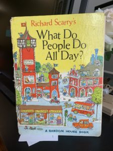
boxes from my recent move, to find my own tattered copy of Richard Scarry’s book.

Was it the cross-​sectioned home revealing the inside of the building and goings-​on of what appears to be an early twentieth century, very large old apartment building? The viewer never sees the house with its front wall. That invisible wall allows us to take in all that happens on a very, very busy day at 3 Maple Street.

The SUPREMELY detailed drawings in Marianne’s book appear to be done in great, old-​fashioned pencil and watercolor. Simply–the best. Some touches of colored pencil, here and there. The palette emits a sunny day in soft washes with just the right amount of puddling. My inner art geek is dying to know. Did she work to size? (which means the size of the printed book.) I wonder if that’s the case because there is so much detail. I would imagine working larger to fit it all in, but if Marianne did that, perhaps all of this lovely graphite would close up and darken and lose its silvery tone.

These are the thoughts that fill my head when inspecting another illustrator’s work.

The details are ABUNDANT and the art tells most of the story. The writing here is mostly visual but WHOOO BOY, what kinds of lists Marianne must have made to keep this all straight as she drew! The day of the tiny Bunny’s birthday is filled with four floors of activity, one tree, two sides of the house, and the street out front. The inhabitants are all drawn with charm and deceptive simplicity. Marianne manages to convey all kinds of mood and emotion in her characters. An annoyed Owl, a sick Bear, Terrible Two Mice Triplets, Expectant Fox Family, Hedgehogs waiting for Dad, Cats moving in, Rabbits burning baked goods, Birds in the branches, a Post-​Cat, a Goldilocks breaking and entering, a Wolf chasing down some pigs and a Little Red Riding Hood walking on by. The tiniest of the characters, the ghost, the ladybug, the bee, the mice children, and a very odd Gnome are the only ones that are hardest to read.

Some of their drawings got tight. It was the Gnome that made me put this book onto my Cintiq and blow it up. I stared. ”IS THAT A…GNOME? A GNOME, TOO??” I started to question my own eyes and rubbed them and wondered if Marianne had eye strain, too, after creating the art. It is quite a feat to draw what is the visual equivalent to a silent movie. I had to go back through all of the pages and see where and when this crazy Gnome came into 3 Maple Street! By making me do that, I knew, Marianne had hooked me into this book experience.

I imagine a child POURING over this book, over and over and over to see all of the details, just as I did with my own Scarry book. This feels very classic, looks very classic, and is illustrated with a lot of class. It feels very real in these times that we stay so close to home and perhaps feel so much more together than we have for a long time.

My ONLY wish? That the book was BIG. 11x15 BIG , like my old Richard Scarry book.

Pure pencil, pure watercolors, pure picture book perfection.

4 out of 5 colored pencils


Kelly Light lives in Amherst, MA but grew up down the shore in New Jersey surrounded by giant pink dinosaurs, cotton candy colors, and Skee-​Ball sounds. She was schooled on Saturday-​morning cartoons and Sunday funny pages. She picked up a pencil, started drawing, and never stopped.

Kelly is the author/​Illustrator of the Louise series. Louise Loves Art and Louise and Andie, The Art of Friendship are the first two picture books in the series. Louise Loves Bake Sales and Louise and The Class Pet are the first readers in HarperCollins’ I Can Read program.

Kelly has also illustrated Elvis and the Underdogs and Elvis and the Underdogs: Secrets, Secret Service, and Room Service by Jenny Lee, and The Quirks series by Erin Soderberg.

Website: www.kellylight.com