
14 February 2023
24 pages
This month’s PB review is by Ryan G. Van Cleave (Owner/Operator of Only Picture Books) and longtime OPB friend (and Ringling College of Art and Design Illustration Professor) John Herzog.
–Ryan’s Review of the Writing–
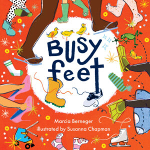
It’s always a bit challenging to review a book with minimal text and eye-catching art. That’s the situation here with Busy Feet, where a pair of kids go throughout their day with the emphasis being on the range of activities they experience in a kind of Energizer-bunny fashion. You almost never see their faces to the point that the feet themselves are essentially the main characters. I’ll let John explain the ifs, hows, and whys of the art’s effectiveness below, but I suggest it’s likely due to vibrant colors and a strong sense of motion.
Let’s circle back to the text. The rhymes are purposefully basic and appear to be chosen with a goal of showcasing opposites (hot/cold, go/stop, high/low) to help very young readers learn important words and concepts. To ensure readers notice these common antonyms, they’re always in UPPER CASE lettering in the text.
The book is especially short for a picture book (24 pages versus the standard 32). Was it originally intended to be a board book? I wouldn’t be surprised to learn that, considering the level of text. This feels like a book intended for 2- to 4‑year olds, though kids in the images seem older than that mid- to late-toddler age. I’m pleased to see that the main two kids/pairs of feet showcase a biracial friendship, and in the cameos of other kids/feet, there’s a child in a wheelchair zooming along. For a pretty small cast of characters/feet, that’s a lot of range.
In the absence of a more defined storyline and with rhyming text this minimal, I prefer to find true rhymes (high/sky) versus near rhymes (done/come). Leaning into the accents in addition to being attentive to syllable counts and rhymes often gives subtle oomph to the text, as well.
Still, Busy Feet this has a pleasing read-aloud quality. And, as John will explain in a moment, the art is sure to appeal. That’s a nice combination. But I wonder–since toddlers buzz through their days in a whirlwind of activity, might we see sequels that showcase other busy toddler body parts? I’m imagining hands and mouths, but surely other options might prove equally intriguing.
4 out of 5 pencils
–John’s Review of the Illustrations–
Reading Busy Feet reminded me of this quote from Douglas Horton:
“The art of simplicity is a puzzle of complexity.”
Susanna Chapman’s illustrations for Busy Feet exemplifies this beautifully. The colors, patterns, design of the characters and peripheral elements – it all feels so simple, yet there’s a heart of complexity beating here.
Even simpler is the story, written by Marcia Berneger. Typeset in Futura (a Wes Anderson staple) and coupled with the simply complex illustrations, this feels more like a visual tone poem than a picture book. The design choices and visual flourishes give this an almost hallucinogenic feeling, which is exactly what the book needs.
I personally found the story (if it can be called that) somewhat lacking, but perhaps I’m expecting too much. After all, if the story were to be more straightforward, perhaps the balance of the simple story with the complex illustrations would cause it to feel a bit uneven. Nevertheless, I think there were more opportunities for Berneger to explore, especially given that the book takes the point-of-view of a little dog following along with the exploits of his child compatriots.
That’s the only weak link, really. On the other hand, the illustrations are incredibly effective and, most importantly, fun. This book is chock-full of abstraction, interesting perspectives, textures you can really sink your teeth into, and old school printing imperfections – such as misaligned print plates. The style is very retro, which helps to make Busy Feet feel at home in both 1963 and 2023.
I have no doubt that this will end up being one of my favorite books of the year thanks to Chapman’s outstanding illustrations.
4.5 out of 5 crayons

John Herzog is an illustrator and educator. He has created work for Scholastic, Houghton Mifflin Harcourt, Little, Brown and Company, Highlights for Children, DreamWorks TV, and Hasbro. He also teaches illustration at Ringling College of Art and Design.
John is a member of the National Cartoonists Society and the Society of Children’s Book Writers and Illustrators, where he received the 2018 SCBWI Magazine Merit Award. He lives in Florida with his family.
John is represented by Kayla Cichello at Upstart Crow Literary.